
SEER - Southeast Equipment Recycling, LLC
Examples of branding and marketing.
SEER - Southeast Equipment Recycling, LLC
Logo Design, Image Development, Marketing
Logo Design, Image Development, Marketing
I designed a logo, business cards, postcards, magnets, brochures, t-shirts, and a website for SEER - Southeast Equipment Recycling, LLC.
The logo and all items had a lot of collaboration between the owners, other designers, and myself. Great feedback and ideas made for some excellent products.
The domain name and catch phrase "We Stick To Metal" is attributed to one of the owners friends. The metal look was desired for the magnet, and made its way to the website, t-shirts, and all marketing.
Visit the website: http://www.WeStickToMetal.com

Logo - 2011

Identifying Mark - 2011

Business Card - Front - 2011

Business Card - Back - 2011

Brochure - Outside - 2011

Brochure - Inside - 2011
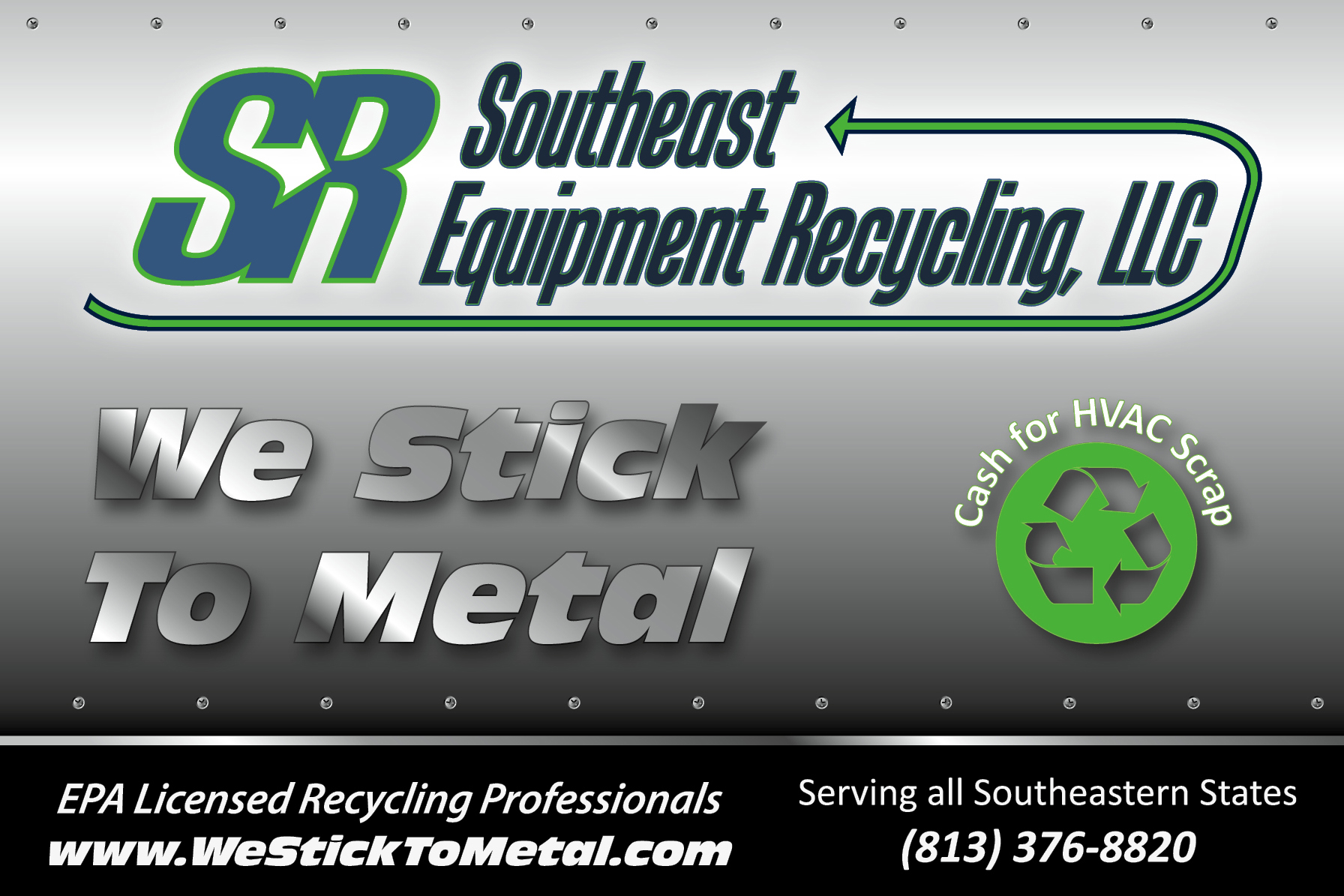
Magnet (4" x 6") - 2011
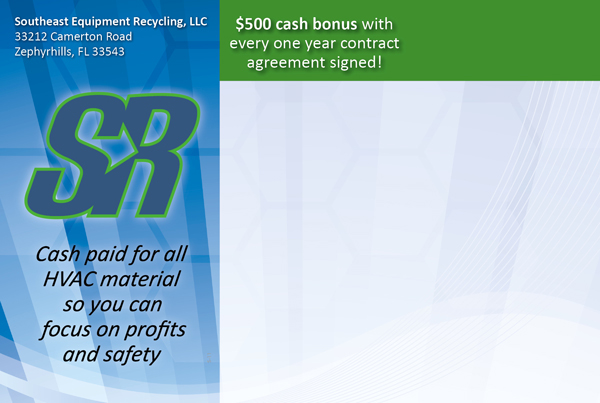
Postcard (4" x 6") - Front - 2011

Postcard (4" x 6") - Back - 2011
This version was designed to be handed out or mailed in an envelope.
Postcard (4" x 6") - Back - 2011
This version was designed to be mailed outside of an envelope.

Website - 2011
Website has a professional grey-look, with an additional palate of blue and green - as in the logo. The header was designed to match the postcard, in industrial metal with rivet design. An electromagnet hovers over the "We Stick to Metal" slogan.

Website - 2011
Elements from the brochure, such as the heron photo are also used on the website, assisting with the consistency and branding of the SEER company. The combination of environmental and industrial achieved the balance that the client desired.