
Seema Amin, DMD
Examples of branding and marketing.
Seema Amin, DMD
Creating Smiles for a Lifetime
Creating Smiles for a Lifetime
Contracted to design the logo, ads, vinyl banner, business cards, letterhead, and envelopes for Dr. Seema Amin. Her practice is in Tarpon Springs, FL.
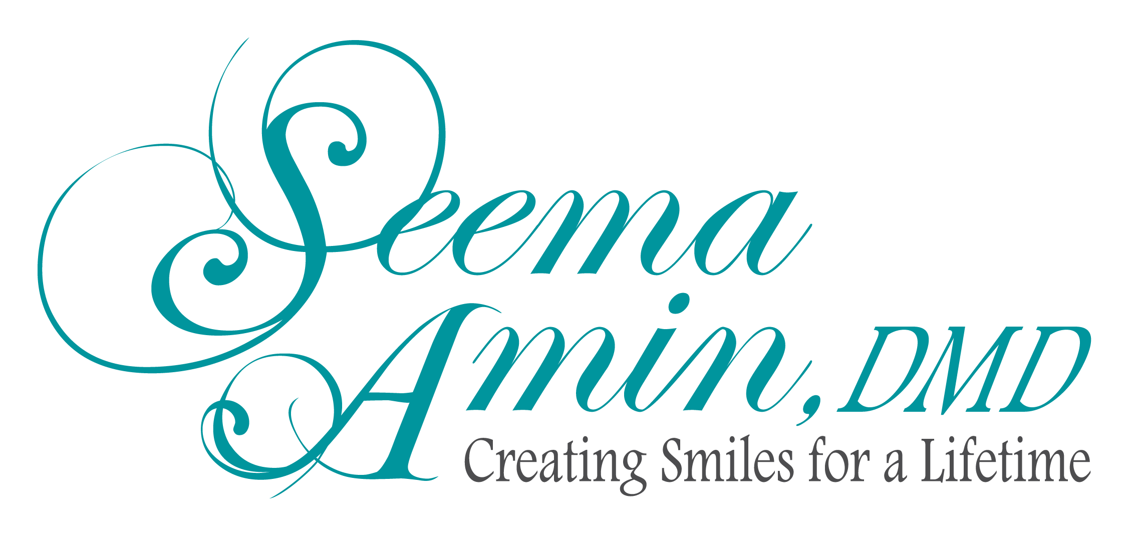
Dr. Amin sent me a web graphic that used the font shown in the "S" and "A" of the logo that I designed. I did some research to find that font, but discovered that it was too fancy to use on the rest of the logo. The final design is a combination of three fonts that work together very well.
I chose the colors for the logo and designs as they are clean, fresh, and include a neutral grey. I think the fresh colors help to illustrate the idea of fresh breath, clean teeth, and professionalism in a tropical environment (Florida). Grey is always helpful to a logo as it is easy to work with for other publications and mediums.
Logo - 2011

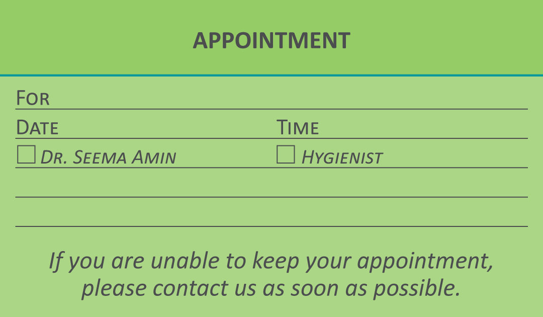
Business Card / Appointment Card - 2011
This double-sided card serves as a business card and appointment card.
This double-sided card serves as a business card and appointment card.

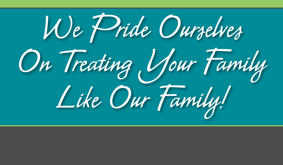
Business Card - 2011
This double-sided card serves as a business card with marketing as it's goal. The front differs in that it replaces "We Pride Ourselves On Treating Your Family Like Our Family!" with "Accepting new patients - Free consultations"
The other language about family is featured on the back of the card.
This double-sided card serves as a business card with marketing as it's goal. The front differs in that it replaces "We Pride Ourselves On Treating Your Family Like Our Family!" with "Accepting new patients - Free consultations"
The other language about family is featured on the back of the card.

1/2 Page Vertical - September/October 2011
Panache Vue' Magazine
This was the first ad that I designed for Dr. Amin. It uses the logo in white on aqua, and a photo of the doctor by Lisa Sibley. The photo of the family is stock photography. These images are used in other designs. (See below).
Panache Vue' Magazine
This was the first ad that I designed for Dr. Amin. It uses the logo in white on aqua, and a photo of the doctor by Lisa Sibley. The photo of the family is stock photography. These images are used in other designs. (See below).

1/2 Page Horizontal - November/December 2011
Panache Vue' Magazine
This was the second ad that I designed for Dr. Amin. It uses the logo in it's original colors on white, and a new photo of the doctor by Lisa Sibley. The photo of the family is stock photography. These images are used in other designs. (See below).
The switch from a full aqua background to white was at request of the client. I broke up the design with a few accents of color from the chosen aqua, lime, and grey. I also bordered the ad in aqua and added a few gradients for a fresh look.
Vinyl Banner - 2011
48" X 96"
This banner was designed for multi-purpose. It was used as a temporary exterior ad to entice new customers, and may be used at events. I tried to limit the text to what was most important. Font sizes were chosen so that drivers and pedestrians could see key information such as the phone number and website.

Envelope - 2011
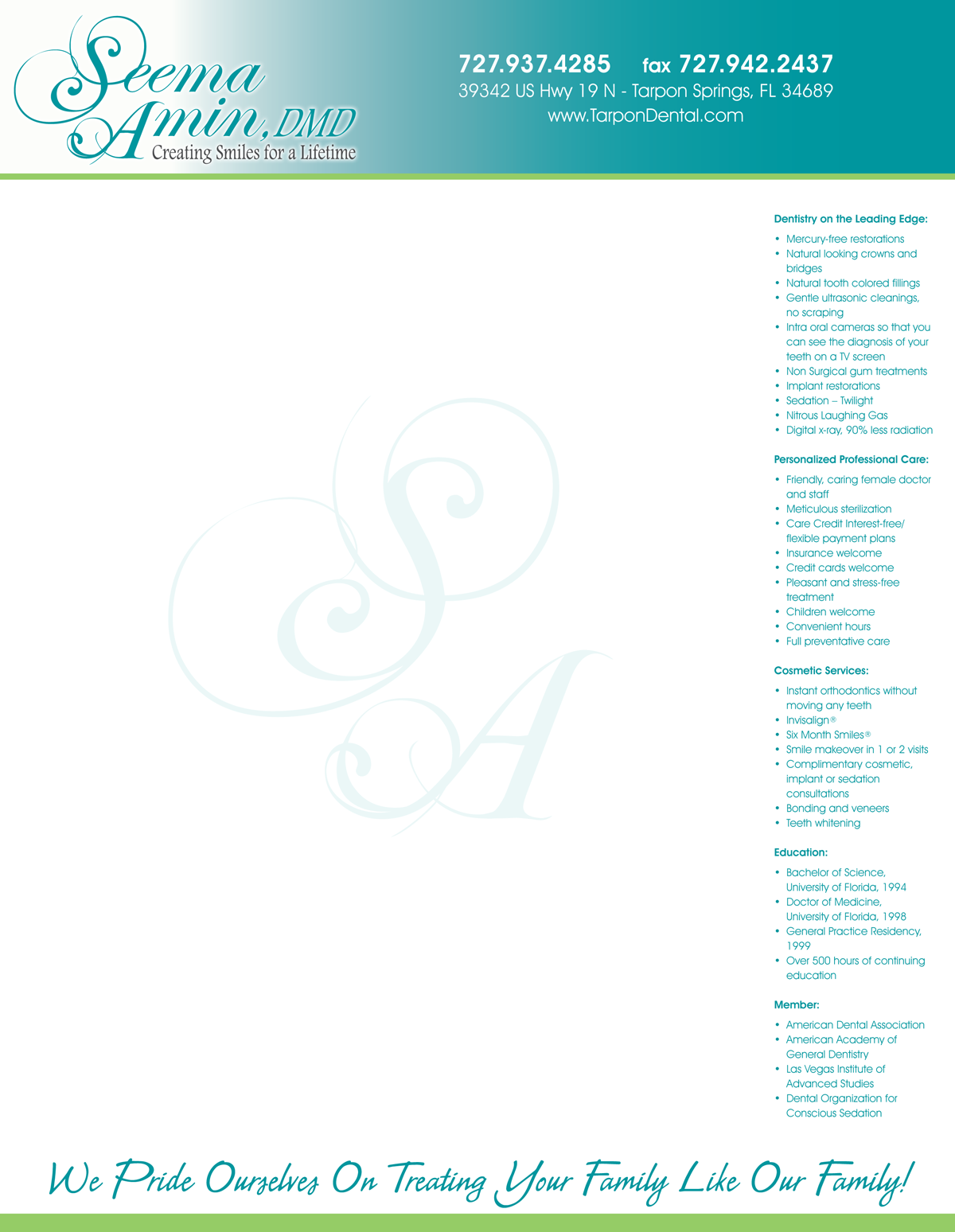
Letterhead - 2011
This is the first printed design that uses the "SA" identifying mark that was designed to work with the logo. Two versions of the letterhead were designed and printed. This one uses a sidebar of services and information about the doctor.
This is the first printed design that uses the "SA" identifying mark that was designed to work with the logo. Two versions of the letterhead were designed and printed. This one uses a sidebar of services and information about the doctor.
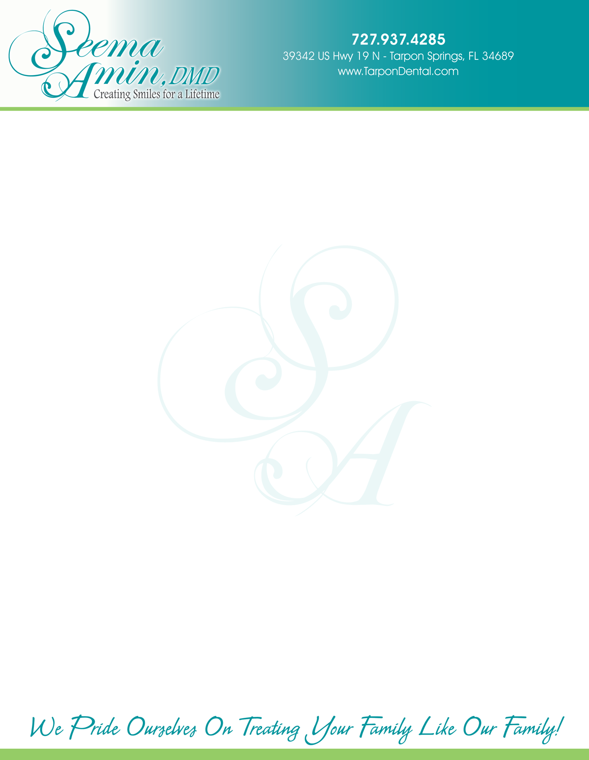
Letterhead - 2011
This is the first printed design that uses the "SA" identifying mark that was designed to work with the logo. Two versions of the letterhead were designed and printed. This one does not include a sidebar of services and information about the doctor.
This is the first printed design that uses the "SA" identifying mark that was designed to work with the logo. Two versions of the letterhead were designed and printed. This one does not include a sidebar of services and information about the doctor.