
Panache Vue' Magazine
Examples of ad design for use in Panache Vue' Magazine.

1/2 Page Vertical - May/June 2011
Panache Vue' Magazine
Ad Design
Ad Design
As Media Sales Specialist, I design some of the ads for non-profit organizations, and my personal clients.
Full Page - Inside Back Cover - Jan/Feb 2011

1/2 Page - March/April 2011
Modeled after a corporate ad that ran in the previous issue, I included a photograph showing window treatments by Hunter Douglas. I added black to the background of the Budget Blinds logo, for balance. The other changes were minor and involved text in the special offers. With a franchise, it is best to design in their style so that ads can be approved quickly by their corporate office, and so that their branding is intact. They were very happy with this clean, smart-looking design.
Modeled after a corporate ad that ran in the previous issue, I included a photograph showing window treatments by Hunter Douglas. I added black to the background of the Budget Blinds logo, for balance. The other changes were minor and involved text in the special offers. With a franchise, it is best to design in their style so that ads can be approved quickly by their corporate office, and so that their branding is intact. They were very happy with this clean, smart-looking design.

1/2 Page - May/June 2011

1/2 Page - March/April 2011
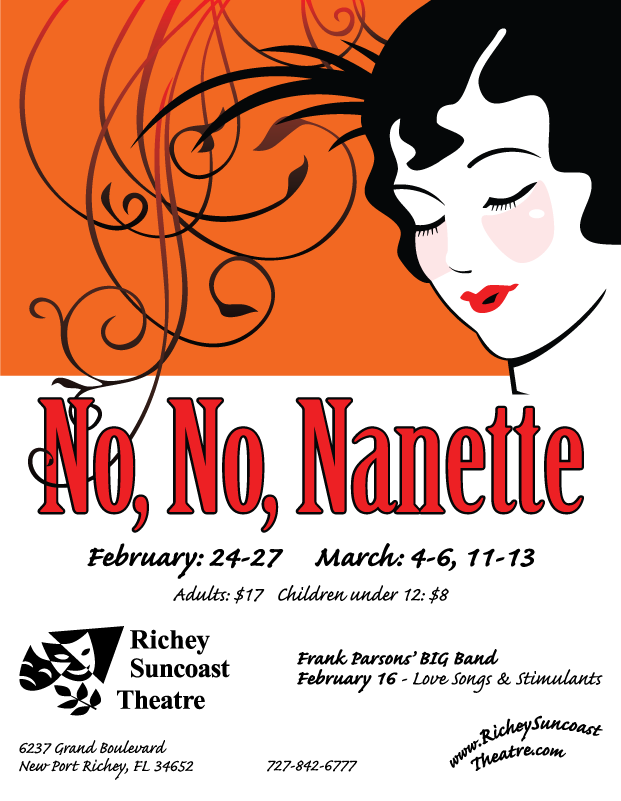
This issue's ad focused on the special show - "Ticket to Broadway." I used some elements from my previous ad, including the logo, website, and contact information. I created the "Ticket to Broadway" text with "Playbill" Font. I designed the tickets and entire ad in Adobe Illustrator. I had the idea for an ad that faded to black on the bottom to support the text, but with a New York skyline, bright lights, or sunset look. Although I could draw these elements, I remembered seeing them before. They are royalty free at these two locations. I just made them fit the design, and altered the colors.
The striped background - http://vectorjunkey.com/detail-Resource-blue_vector.php
The skyline - http://www.123freevectors.com/city/30-skylines-free-vector-pack

1/2 Page Ad - May/June - 2011
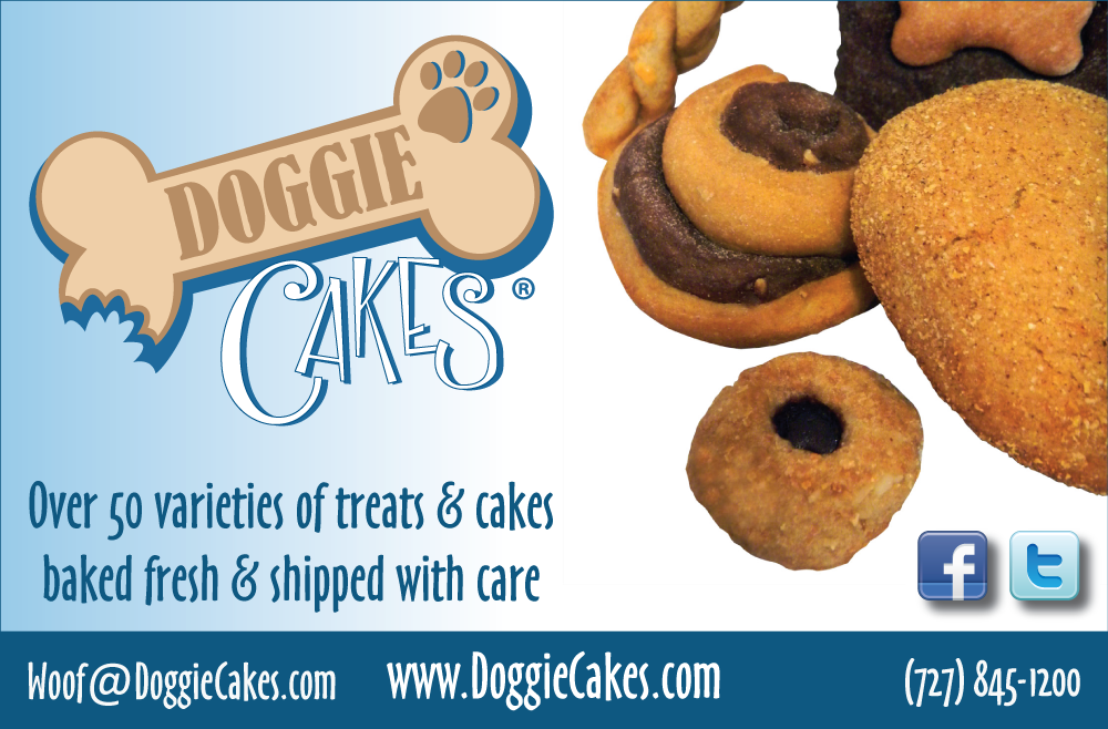
This ad was designed as a part of the branding/marketing campaign for my own company - Doggie Cakes.
Related - http://bit.ly/eC
Related - http://bit.ly/eC
1/2 Page - March/April 2011
This ad was designed as a part of the branding/marketing campaign for my own company - Doggie Cakes.
Related - http://bit.ly/eC0PFm
This ad was designed as a part of the branding/marketing campaign for my own company - Doggie Cakes.
Related - http://bit.ly/eC0PFm
1/2 Page - July/August 2011
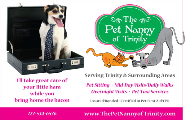
This ad was designed as a part of the branding/marketing campaign for the Pet Nanny of Trinity. The logo and colors were already created by a different designer. The bright pink was only a small portion of the logo (edge of the sign). I decided to make it integral to the design, and put together the marketing language of this ad, along with a photo from IStockPhoto.com.
This ad was designed as a part of the branding/marketing campaign for the Pet Nanny of Trinity. The logo and colors were already created by a different designer. The bright pink was only a small portion of the logo (edge of the sign). I decided to make it integral to the design, and put together the marketing language of this ad, along with a photo from IStockPhoto.com.
Related - http://bit.ly/hVXgRk

1/2 Page - May/June 2011
This ad was designed as a part of the branding/marketing campaign for the Pet Nanny of Trinity. The logo and colors were already created by a different designer. The bright pink was only a small portion of the logo (edge of the sign). I decided to make it integral to the design, and put together the marketing language of this ad, along with a photo from IStockPhoto.com.
This ad was designed as a part of the branding/marketing campaign for the Pet Nanny of Trinity. The logo and colors were already created by a different designer. The bright pink was only a small portion of the logo (edge of the sign). I decided to make it integral to the design, and put together the marketing language of this ad, along with a photo from IStockPhoto.com.
Related - http://bit.ly/hVXgRk

1/2 Page - March/April 2011
This ad was designed as a part of the branding/marketing campaign for the Pet Nanny of Trinity. The logo and colors were already created by a different designer. The bright pink was only a small portion of the logo (edge of the sign). I decided to make it integral to the design, and put together the marketing language of this ad, along with a photo from IStockPhoto.com.
Related - http://bit.ly/hVXgRk